I was speaking with a client recently who wanted to add responsiveness to his website. It would require some pretty pricey coding and design work. With that in mind, I think it’s better to just integrate a new theme. It would take the same amount of time and would probably cost less. The problem is, I don’t think responsive themes—the way most of them work—are worth the effort.
We’re in an odd time right now with regard to web design. I like responsive designs that stack content boxes to accommodate various screen sizes (example), but I also think it’s a stopgap development. It can make sites seem disjointed and difficult to follow. Confusing or annoying the user is the last thing we want. Too often, mobile sites deliver the user a more limited experience than they would get on a computer. That’s one of the reasons why so many mobile users opt for the desktop view.
Over the next few years, I think the pendulum of popularity will swing away from native apps and toward mobile apps.
I think it’s safe to predict that, in the future, everyone is always connected to the internet. If you’re always connected, then what’s the difference anyway? I think the trend will be to meet in the middle between apps and websites and develop slimmer, more intuitive portals that act like branded picture frames around content. That’s not so different from the way apps are currently laid out, and consumers have voted with their wallets for more app-like design. As users get more comfortable with smart devices, and with gestures like swiping and zooming, more of those features will be built into hardware in general, and software in particular, to take advantage of cleaner design.
But content is still king. Even the shiniest wrapper won’t sell shit chocolate for very long.
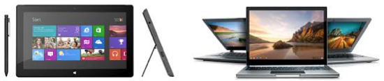
It’s time to give the users what they want and try to stay out of their way. Microsoft realizes this. That’s one of the reasons why they redesigned Windows 8 to be touch-centric, and why they shook up their OEM community by launching the Surface line of tablets. Google made a similar move with the Chromebook Pixel, a touchscreen laptop that’s entirely cloud-dependent.
Let’s recap this. Microsoft jumped head-first into a new, touch-capacitive version of Windows aimed at retaining corporate clients, and then released the ARM-based Surface RT? Then Google released what’s essentially a mobile tablet with a keyboard and loaded it with the web-based Chrome OS rather than Android? These are odd moves, but they’re the obviously best moves that Microsoft and Google think they can make at this odd time. It reeks of fence-testing, and that’s not necessarily a bad thing.
The problems with these products is that they’re trying to serve two masters, desktop and mobile, but desktop and mobile have neither fully merged nor fully diverged. That’s why these devices seem awkwardly targeted and poorly positioned. I think we’ll look back on them in a few years the same way we look back on the Palm Pilot.
Only with hindsight can we see that the Palm Pilot evolved in the odd era between dumbphones and smartphones. And only with hindsight do we recognize the Palm Pilot as an expensive toy that was both ahead of, and behind, its time.
Tech is rapidly evolving. Web design is racing not only to adapt to the emerging tech, but also to users’ ability and expectations. Ten years ago, the internet was filled with websites built on frames and flash. Those are mostly gone now, thanks to Google and Apple, respectively. The popularity of some coding languages and content management systems have risen and declined in that same time. Style is always changing, and we have to change with it. It’s just another operating expense.
It’s no longer good enough for things merely to function. “If it ain’t broke, don’t fix it” doesn’t work with e-commerce. Websites today must look and feel current because perception is a bigger motivator than fact.
If I walked into a dentist’s office that had musty carpet and smelled like cat piss, I wouldn’t stick around to get my teeth cleaned no matter how good the dentist was. My perception would be that if the dentist was successful and respected, he could afford new hardwood floors and a better air filter. How many times have you backed out of an online purchase because the website seemed insecure? How many of your prospects have backed away from you?
Good examples of websites that are leading the way with responsive design are USA Today and Mashable.
For example, click on this article from USA Today that echoes some of what I’m saying about this being a time of great transition.
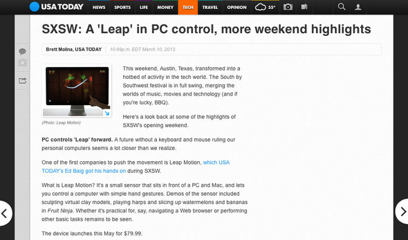
Do you see how the website layout is doing its best to get out of the way? It’s putting the content first, and it’s the same user experience for someone on a desktop PC and a person on a tablet. It still resorts to some stacking for small smartphone screens, but the stacking and the mobile navigation don’t get in the way of the content. The New York Times is currently trying to get out of their readers’ way as well.
Now look at Mashable’s scalable design.
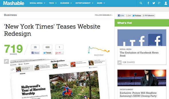
Scroll down the homepage. You’ll run out of interest before the website runs out of content. Do you notice how minimal the actual site is? It’s just a bar at the top. The bar changes for desktop versus mobile, but it doesn’t change all that much. It may seem like a simple layout, but this interface presumes that the user is an intelligent person capable of gaming out the menu. It’s bold, really. It stands in stark contrast to so many layouts and systems that assume the user is an idiot.
These websites aren’t perfect. They’re reacting to the same challenges that we face, and they’re failing at some of those challenges.
I should stress that being current is not the same as chasing every trend. I consider myself to be a pretty “current” guy, but you won’t see me walking down the sidewalk in skinny jeans and a grumpy cat t-shirt. Those are fads, not trends. That’s why stackable, responsive designs seem so awkward; they’re fads too.
They’re not quite the old thing, but they’re obviously not the new thing either. Like the Palm Pilot before, they’re just a product of the odd time we’re living in.
If you find yourself at a Morton’s fork where you have to deliver your mobile users a non-responsive website, or deliver everyone an awkwardly responsive website, then go with the non-responsive one for the time-being. It’s better to save your money now and do it right next year than to do it twice in two years because you and your customers are unhappy with the compromise. Mobile users are pretty good at pinching and zooming their way across desktop sites these days. Better solutions will come along in time.
If you manage a WordPress.org website, then it’s simply a matter of waiting for a theme to come along that works well for you and your customers. In the meantime, get your current website into shape. Lose the fluff. Cut your word count by half. Drop the blogroll. Focus less on your features and more on the benefits to your customers. They’ll appreciate your direct approach, and you’ll appreciate the spike in traffic.


